Teaching AI to generate slides in Figma

area
Automation & AI Design
responsibilities
- AI prompt design & refinement
- Figma component system architecture
- Design system consistency across generated output
year
2026
tools
Figma, Claude, Google Sheets
The problem

Challenges
Speeding up CPVT wasn't just a research-team convenience — it meant faster, more current information reaching every team that relies on it to make decisions.
⏱️
REDUCE manual process
Building the monthly CPVT report by hand took around 4 days of work, every single month.
🤖
Get AI to follow the design system, not improvise
Early attempts had the AI generating a different, inconsistent layout every time — even from identical source data.
🎨
Fix incorrect data interpretation
The AI initially inverted the color logic for variations, marking increases in complaints as positive instead of negative — and, separately, summarized comments instead of listing them in full, silently dropping information from the slides.
🗂️
Keep a growing archive organized
As reports accumulate month over month, the system needed a way to stay structured instead of becoming a flat, unmanageable file.
Results
1 week
from first attempt to production
~12
slides generated automatically each month
from 4 to 1
days to build the full monthly report
What didn’t work first
My first attempt was to ask the AI to replicate the visual model of the reports the team already used, without any defined structure.
It didn’t work: every generation came out different, inconsistent, and visually below the bar — even when the input data was correct.
Building a component library the AI could trust
This pattern came from prior, separate work I’d done exploring how AI performs inside Figma via MCP — testing which kinds of instructions produced reliable results and which didn’t. That experience already told me the AI performed better working against a defined component than against an open-ended instruction.
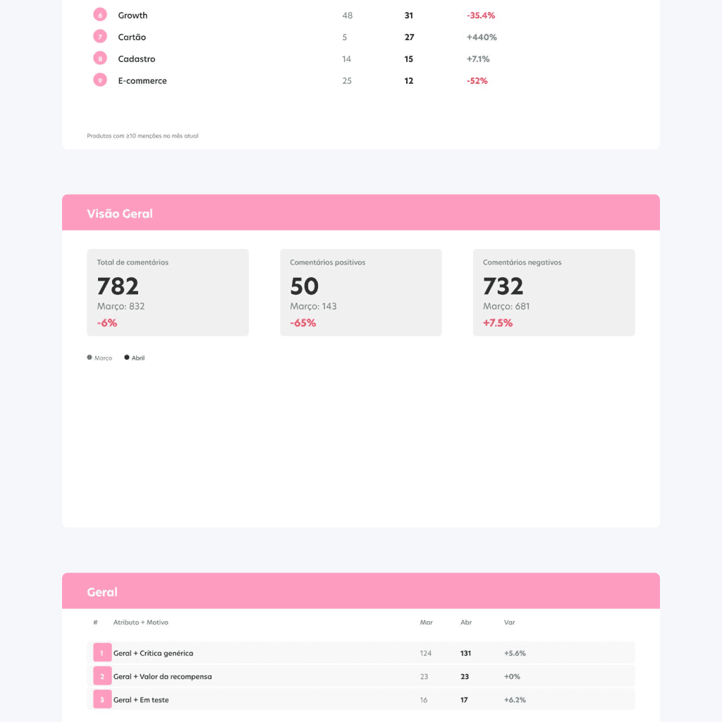
I changed approach: I built specific components in Figma — cover, summary, item, and header — with custom properties marking exactly where each piece of analyzed data should go, and instructed the AI to reuse those instances instead of building elements from scratch.
The first prompt under this approach already outperformed every previous attempt; I refined it over roughly 10 iterations until it matched the team’s design system consistently, every time.


Getting the details right
Two specific fixes came out of testing: the AI initially inverted the color logic for variation — green for increases, red for decreases — when it should have been the opposite, since a rise in complaints is a negative signal.
Separately, it also summarized comments instead of listing every one, quietly cutting information the report was supposed to preserve in full.
Both were corrected through prompt refinement.


Built to scale, not just to work once
To keep the file usable long-term, the system creates a dedicated page for each month inside the Figma file and places that month’s generated slides inside it — keeping a full year of monthly reports organized in one place instead of scattered across a flat file.
Validating before going live
Before this replaced the manual process, every output was checked against a manual analysis of the same data, side by side, until we confirmed the AI’s version matched consistently. Only then did it become the team’s actual monthly process.


In production, every month
The system has been in production since April 2026, used monthly by the research team without a single failure to date. Internally, the output was recognized as visually stronger than other AI-generated presentations the team had seen up to that point.
Sharing the system
I documented the process and presented it to the design team, with the full workflow saved to the team’s repository — which later evolved into a Claude skill.

A second, more robust generator
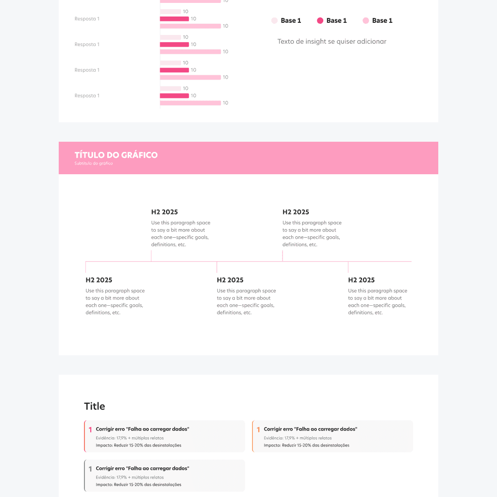
The CPVT generator became the foundation for a second, more complete tool: a general presentation generator for the research team. Where the first system was built around one fixed report structure, this one supports a full library of chart types — pie charts, comparative bar charts, vertical insight cards, timelines — so the research team can assemble presentations for any study, not just one recurring report.

Retrospective
Turning a manual, repetitive process into a reliable AI-driven system taught me that the hardest part isn’t getting AI to generate something — it’s getting it to generate the same quality every time, without supervision.
If I were to do this again, I’d stress-test the AI’s handling of full information earlier. One issue only surfaced after we were already testing in production: the AI would summarize comments instead of listing every single one, quietly dropping information the report needed to preserve in full. It’s the kind of failure that’s easy to miss when everything looks fine on the surface.
As next steps, I want to keep building on this foundation — extending it to other recurring reports across the team, and refining how far a single, well-structured system can scale before it needs to be rebuilt.