
Connecting NFT
sellers and lovers

OVERVIEW
The NFT market (Non-Fungible Tokens) has grown exponentially in recent years, becoming a significant source of income for many people.
With the aim of helping this market grow even more in Brazil, the NFT Club was created. A platform to conduct NFT transactions, both for creators and collectors.
AREA
UI Design
year
2022
Tools
Figma
CLIENT
Clube NFT
The problem
Create a website for buying and selling NFTs from scratch.
Although the client provided a rough outline of what would be necessary for the development of the project, the site had heavy and messy content, difficult to navigate and was not personalized in any way.
Thus, we wanted to create a site that instilled confidence in users, providing them with a good experience in buying and selling NFTs.

Workflow
As important as my skills, I care about communication, deadlines, and the progress of the project. A successful job is not just a beautiful design, but a process that meets everyone's expectations.
🚀
Kickoff
1/7
Initial meeting with the client to define project expectations
🔍
Research
2/7
Exploratory research to familiarize oneself with the subject and project.
📝
Content
3/7
Development of the content that is created and validated together with the client.
🖥️
Wireframes
4/7
Organization of pages and content.
🎨
Design
5/7
Finalization of the wireframe with colors, typography, and illustrations.
🎮
Prototype
6/7
Creation of animations and faithful visualization of the website.
🤝
Handoff
7/7
Preparation of the files and components to be passed on to development.
Site Map
To get an overview of all the pages on the site, we list all the main content that each user could access starting from the homepage of the site.

Along with the research and the reference moodboard, wireframes are fundamental parts of my creative process. They start with scribbles on paper, and as the idea is validated, I turn them into medium-fidelity files.


Refinament
After the validation of the ideas, the wireframes are refined with the addition of colors, typography, icons, images, and brand elements.


Brand reinforcement
Buying an NFT is not as easy as it seems; there may be technical and security doubts. That's why we wanted to ensure that the NFT Club should provide a safe and focused experience so that users have no doubts about what to do.

Prioritizing modernity, we established a technological, neutral, consistent, flexible, and timeless visual language, ready to serve the brand for many years.

Consistency
To maintain consistency and harmony in the layout, facilitate navigation, and make the user experience even more satisfying, grids have been used.

Dark and light mode
At the request of the client, dark and light mode versions were developed, giving the user the option to choose their preferred mode.


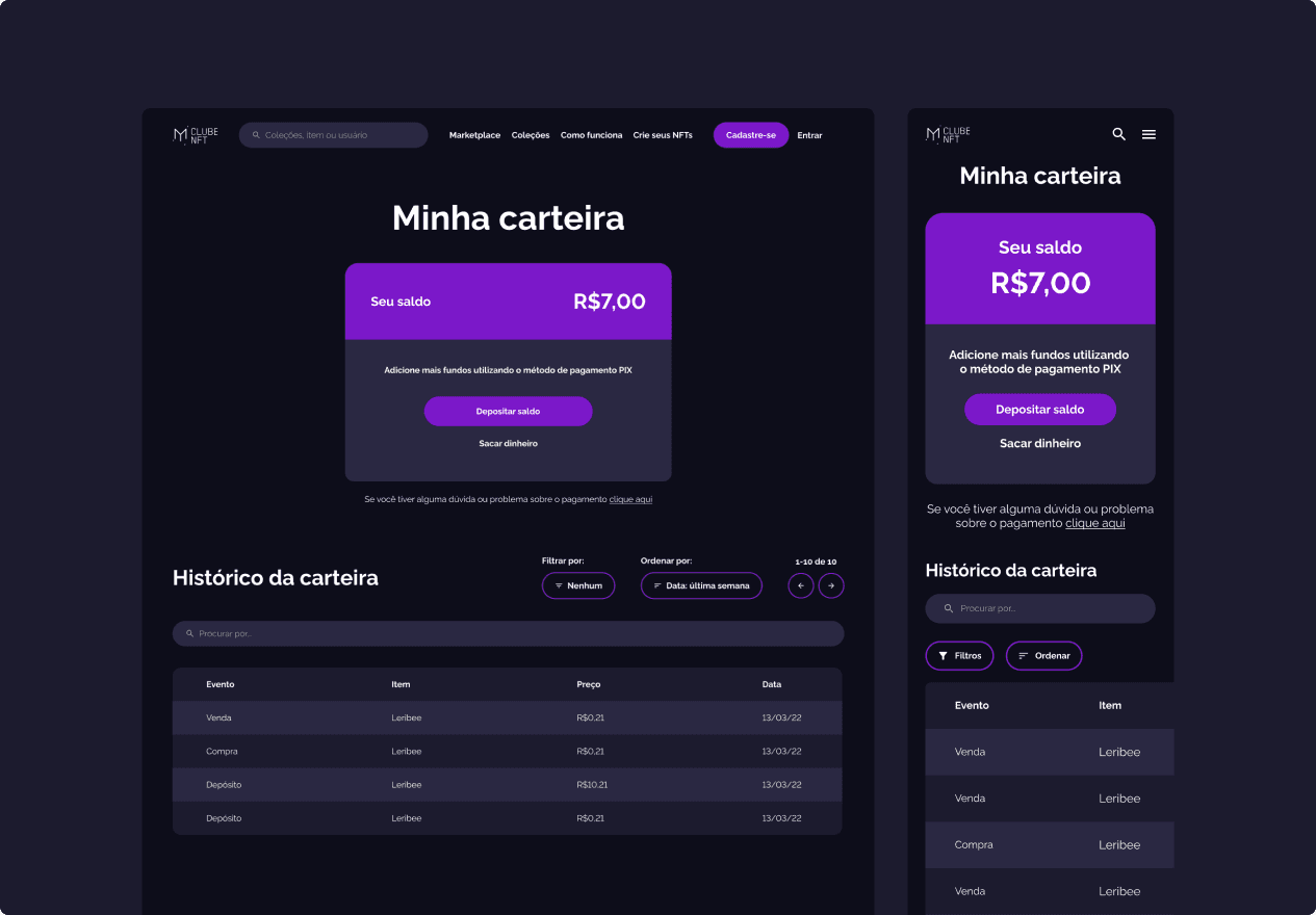
Responsive
It is no mystery to anyone that most access to a site comes from mobile devices.
Therefore, one of my main concerns was to design a site with a responsive design.


Micro interactions
In addition to making the website more dynamic, micro-interactions are an option that help to make the user experience memorable, especially by helping them visualize the results of their actions.


Reducing frustrations
Accessing an error page is not a good experience and can cause feelings of frustration.
To ease the situation, I used illustrations along with the buttons and menus. This way, users can access the page they are looking for.

Modern, technological and secure


Retrospective
Without a doubt, this was a project that I really enjoyed participating in. In addition to having complete freedom and support from the client side, I felt a significant evolution in my research skills and in the relationships/meetings with colleagues and also developers.
Designing for both desktop and mobile was also another point I wanted to highlight. Although the content on both devices is the same, depending on the layout it may not work as well as you imagined.
Creating the design in two versions, dark and light mode, was also a challenging task; it was a great learning experience to find colors that worked well in both situations.

